Your designer wants the brand colors. There isn’t a file. Someone eyedroppered the logo two years ago and the hex code lives in a Slack thread.
Meanwhile a rep just sent a deck that describes your product as a “workflow automation platform.” The website says “operations intelligence.” A third version showed up in last week’s investor update.
Both of these get called the same thing internally. Somebody says “we should do branding,” everyone nods, and a budget gets pointed at whichever agency answers the phone. But those are two different problems with two different fixes, and buying the wrong one first is how a branding budget disappears without anything getting better.
It matters more than it sounds, because the sale is already hard. Gartner’s sales research found that 77% of B2B buyers rated their most recent purchase “extremely complex or difficult,” with buying groups of six to ten people who each have to complete their own buying tasks, including agreeing with each other. That figure comes from Gartner’s self-reported buyer survey, relayed through marketing writer Heidi Cohen’s recap rather than a primary Gartner release. A buying group that can’t get a straight answer about what you do has one more reason to stall.
Build the message blueprint first if your problem is that people describe the company differently. Build the style guide first if your problem is that assets look different from each other. Most early-stage teams have the first problem, and standard branding practice puts strategy and messaging ahead of visual identity design.
What a Brand Style Guide Actually Contains
A style guide is a rulebook for execution. It answers “how does this look and sound” so that anyone producing an asset, in house or contracted, doesn’t have to guess or ask.
In Designing Brand Identity, the branding-industry text by Alina Wheeler, the identity system is built from a defined set of components: the logo plus its clear-space and usage rules, a color palette with actual values, a typography system, and imagery direction. Triaza’s own brand style guide covers the same ground, adding brand voice and messaging guidelines.
That component list is the boring part, and the boring part is the point. A style guide’s job is to remove decisions from people who shouldn’t be making them.
Real Ones You Can Go Read
The fastest way to understand what you’re buying is to open somebody else’s.
Mailchimp publishes its content style guide as an open-source repository under a Creative Commons license, organized into numbered sections: writing principles, voice and tone, grammar and mechanics, web elements, and a word list. The GOV.UK Design System is MIT-licensed and community-maintained, split into Styles, Components, and Patterns.
Notice that both live in version control with commit histories rather than as a PDF someone emailed once. That’s worth copying. A style guide that can’t be updated stops being used the first time it’s wrong.
Where Brand Voice Sits
Here’s the thing that makes these two documents easy to confuse. Voice belongs to the style guide, but it’s made of words, so it feels like messaging.
Nielsen Norman Group’s framework describes tone along four bipolar dimensions: formal versus casual, serious versus funny, respectful versus irreverent, and matter-of-fact versus enthusiastic. That’s a usable structure for a voice section, because it turns “sound approachable” into something two writers can actually agree on.
Voice also isn’t decoration. In an NN/g study that varied only the tone of otherwise identical content across four industries, trustworthiness explained 52% of the variance in how desirable people found the brand, with friendliness adding a further 8%. That was a quantitative online survey of 100 American users rating fictional brands on self-reported scales, so it measures perception rather than behavior, and it shows correlation between tone and perception rather than proving causation.
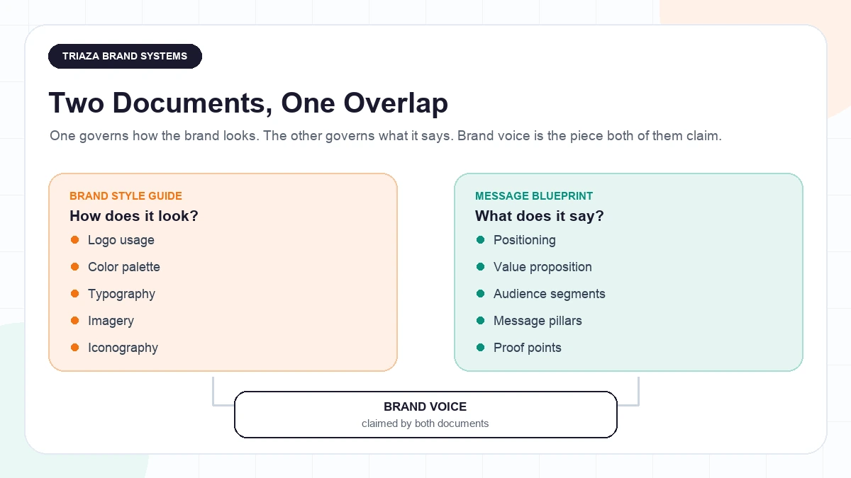
Keep the line clean in your own head: voice rules tell you how to say it. The message blueprint tells you what to say.
That voice section has a second job as soon as AI tools start drafting for you, because a model can only apply what’s been written down explicitly. We cover what that takes in brand voice as a data asset.
What a Message Blueprint Actually Contains
A message blueprint is the messaging architecture underneath every asset. Positioning, who each message is for, the value proposition, the proof behind each claim, the specific language for each audience, and the objections that audience raises.
If the style guide keeps your decks from looking like they came from four companies, the blueprint keeps them from arguing with each other.
Heavybit, which publishes guidance for founders building developer-facing companies, puts the sequencing bluntly: “While it’s important to have a consistent style guide, you can worry about Oxford commas after you’ve completed your brand messaging framework.” That’s one practitioner-publisher’s advice rather than a research finding, with no study behind the ordering, but it names the tradeoff honestly.
Positioning Sits Above Both Documents
Neither document can be written until you’ve made a decision that isn’t a document at all.
Geoffrey Moore’s positioning template from Crossing the Chasm is a useful forcing device: for a target customer who has a need, your product is a category that delivers a benefit, and unlike the main alternative, it does something specific. You can’t fill that in without deciding what you are and what you replace.
April Dunford breaks positioning into five components: competitive alternatives, the differentiated capabilities only you have, the value those create for customers, target customer segmentation, and the market category you place yourself in. She’s also blunt about the boundary this whole article turns on: positioning, she writes, “is not equivalent to messaging.” Both frameworks come from practitioners who do this for a living, not from study findings. They’re useful because they force a decision, not because someone measured them.
If you can’t answer who this is for, what it replaces, and why it’s better, you’re not ready to write either document. That decision is its own piece of work, and it’s the thing most “our messaging is off” complaints actually turn out to be.
Donald Miller’s Building a StoryBrand offers one repeatable structure for the layer above that: a customer with a problem meets a guide who gives them a plan and a call to action. Use it or don’t. It’s a messaging tool, and it’s no help at all with your color palette.
Read the Symptom Before You Pick the Document
Most teams already know which problem they have. They just haven’t sorted the symptoms into two piles.
Symptoms of a missing message blueprint:
- Every rep explains the product differently, and each version is defensible
- The website and the sales deck make different claims, not just different-looking ones
- Marketing and sales describe the ideal customer differently when asked separately
- Content reads as generic because nobody agreed what the value proposition is
- The founder’s pitch lands and nobody else’s does
That last one is the tell. Strategic-narrative consultant Andy Raskin argues that when a company doesn’t drive one narrative from the top, teams fill the vacuum with their own, each telling a story that works for their audience and nobody else’s. That’s his own observation from positioning more than 40 leadership teams, not a survey, but it describes a pattern most founders recognize immediately. It’s also why founder-led thought leadership tends to outrun the rest of the company’s messaging: one person has the story straight and nobody wrote it down.
Symptoms of a missing style guide:
- Designers and contractors keep asking for colors nobody can produce
- The logo appears in four different lockups across three decks
- Every deck uses a different font because there’s no agreed type stack
- Work from two agencies looks like work from two companies
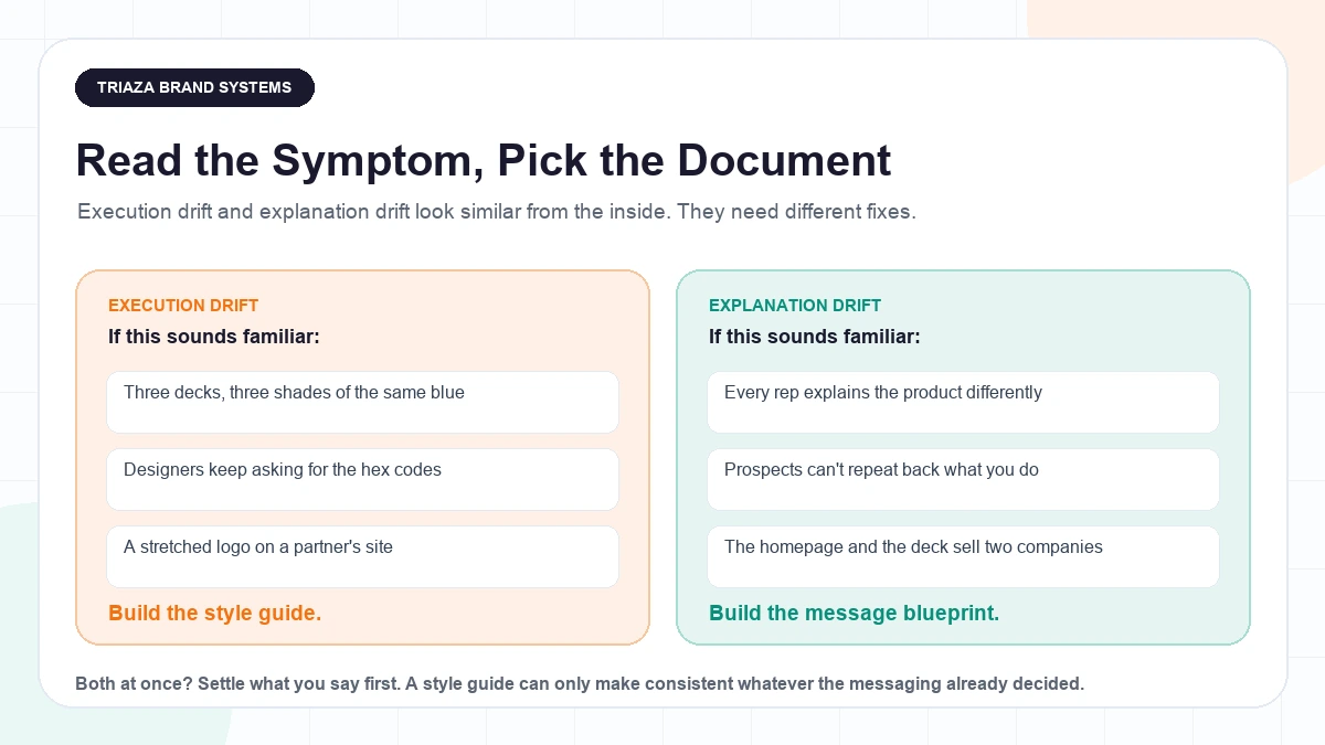
The distinction that does the work: if two assets make different claims, that’s messaging. If they make the same claims and just look different, that’s the style guide. Run your last three decks against that test and you’ll have your answer in about ten minutes.
What Each Kind of Drift Actually Costs
Both problems cost you something. They cost you different things, which is why the order matters.
Explanation drift costs you deals that never become losses. April Dunford, citing a study in a post on her own site, notes that at least 40% of B2B sales processes end in “no decision,” with the buying team unable to agree internally rather than picking a competitor. The underlying release from Challenger puts the figure at 38% of purchase attempts and describes buying groups averaging upwards of 11 stakeholders. That release is a vendor announcing its own study; it names no sample size and publishes no methodology, so treat it as a directional figure rather than a measured one. Either way, those aren’t deals you lost on features. They’re deals where a group of people couldn’t build a shared answer to “what is this and why now.”
Execution drift costs you credibility before anyone reads a word. In a study of 2,684 participants evaluating live websites, Fogg and colleagues found the “design look” of a site was the single most frequently mentioned factor in credibility judgments, appearing in 46.1% of comments, ahead of anything about the site’s actual information. Those were open-ended participant comments coded into categories by the researchers, so they capture the reasons people give for trusting a site, not a measured effect on revenue.
It also creates a steady tax on everyone producing work. In Lucidpress’s survey of brand management professionals at over 200 organizations, 81% said their organization still deals with off-brand content, and respondents estimated consistent branding “can increase revenue by 33%,” up from 23% in the same survey three years earlier. That revenue number is a vendor-sponsored survey asking brand managers to estimate their own upside, not an audited or independently verified outcome, so read the 81% as the more useful half of that finding.
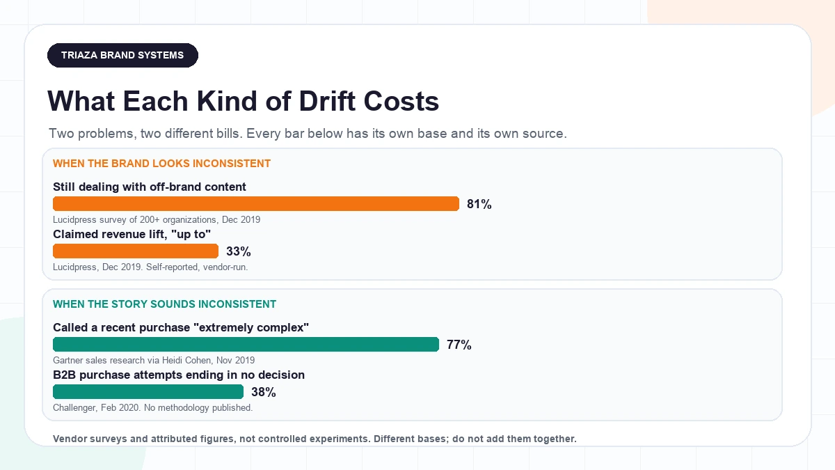
Here’s the judgment call underneath all of it, and it’s reasoning rather than anything a study establishes: scrappy visuals are a survivable problem. Plenty of companies grew with an ugly deck. An unclear story is harder to survive, because it doesn’t produce a complaint you can see. It produces silence.
How Your Stage Changes the Answer
The default holds for most early-stage teams, but three things genuinely flip it. This framework is judgment, not research, and there’s no headcount threshold or funding stage that decides it for you.
Who’s producing the most artifacts each week? If you have designers and contractors shipping assets faster than sales is shipping pitches, the visual bottleneck is the expensive one. A team producing twenty pieces of collateral a month with no color spec is burning real hours on avoidable rework.
Is positioning already settled? A founder-led company with one repeatable pitch that closes already has a message blueprint. It lives in one person’s head. Writing it down is a transcription job, not a strategy engagement, and that changes the sequence: capture it quickly, then spend the real budget on identity.
Which symptoms do you actually have? Run the test above. If both piles are full, start with positioning, because both documents are downstream of it and you’ll rewrite them both otherwise.
There’s also a middle path teams underuse. You don’t need a full identity system to unblock a designer. A one-page spec with the palette, the type stack, the logo files, and clear-space rules solves the immediate problem, and you can build the real guide once the story is settled. Doing it that way means you’re not paying twice, which is the actual risk in getting the order wrong: identity work built on unsettled positioning gets redone when the positioning moves.
Pick the One You Can Defend
Stop treating “branding” as one purchase. Open your last three sales decks and your homepage side by side, and ask whether they make different claims or just look different. That’s a twenty-minute exercise and it decides where the money goes.
If they make different claims, you need the message blueprint, and you probably need to settle positioning first. If they make the same claims in four different typefaces, you need the style guide.
Wheeler’s process sequences it the same way: clarify strategy, then design the identity. Heavybit tells founders the same thing. Both are practitioners describing what tends to work, not evidence, but the reasoning holds on its own. A style guide can only make consistent whatever your messaging already decided. If nothing’s been decided, all you’re buying is a very well-typeset disagreement.
If you’d rather not run that audit on yourself, an outside read on which document you actually need is usually a short conversation, mostly because someone who isn’t inside the company can hear the four different versions of your pitch as four different versions.
Questions Founders Keep Asking
Do I need a brand style guide or a messaging document first? For most early-stage teams, the message blueprint. A style guide is a set of rules for executing a story, so it can only enforce consistency on whatever your messaging already decided. The exception is a team already shipping high volumes of design work with no color or type spec, where the visual rework is the more expensive bottleneck. This is standard practitioner sequencing, not a research finding.
What’s the difference between brand guidelines and a messaging framework? Brand guidelines govern how things look and sound: logo usage, color palette, typography, imagery, and voice. A messaging framework governs what you claim, to whom, and with what proof: positioning, value proposition, audience-specific messages, and proof points. Brand voice is the overlap, which is why the two get bundled and mis-bought.
My sales reps all pitch differently. What do I fix first? The message blueprint. Strategic-narrative consultant Andy Raskin argues that when nobody drives one narrative from the top, teams invent their own, which is his observation from positioning more than 40 leadership teams rather than a survey finding. A style guide won’t help here. Every rep can be perfectly on-brand visually while saying something different about what you sell.
Our website copy doesn’t match our sales deck. Is that a design problem or a messaging problem? Almost always messaging. Here’s how to tell: if the two documents make different claims about what the product is, who it’s for, or what it replaces, that’s a messaging gap. If they make the same claims and simply look different, that’s a style guide gap. Different claims mean nobody has settled the position yet.
My designer keeps asking for brand colors we don’t have. Can I skip the full style guide? For a while, yes. A one-page spec with the color palette, the type stack, the logo files, and clear-space rules unblocks a designer without commissioning a full identity system. That’s a reasonable stopgap rather than a best practice, and it buys you time to settle the messaging before you pay for identity work that positioning changes might undo.
Do I need positioning before either one? Yes, and it’s the step teams skip. Both documents are downstream of it. April Dunford frames positioning as five components: competitive alternatives, your differentiated capabilities, the value they create for customers, target customer segmentation, and the market category you claim. That’s a practitioner framework, not a study. The short test: can you say who this is for, what it replaces, and why it’s better? If not, start there.