The site is done. The domain isn’t pointed yet. Somewhere in Slack there’s a list with forty items on it, in no particular order, and three of them are load-bearing while the rest can wait a month. Nobody has said which three.
That’s the real problem with launch checklists. Forty undifferentiated items read as forty equal items, so you do the five easiest, run out of Thursday, and ship anyway. The useful version sorts by consequence.
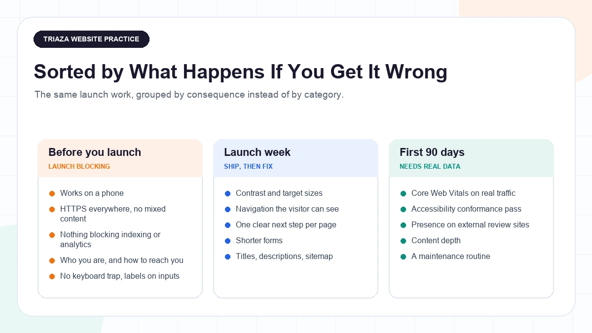
Before you point the domain, confirm five things: the site works on a phone, it’s served entirely over HTTPS, the homepage says who you are and what you do without scrolling, someone can reach you, and nothing is quietly blocking search engines, analytics, or keyboard navigation. Contrast, form length, and speed tuning can wait a week.
One thing worth settling first, because it’s usually sold to you backwards: none of this is a ranking switch. Google’s framing, from when it introduced page experience signals, is that they’re among “hundreds of signals” and that “a good page experience doesn’t override having great, relevant content. However, in cases where there are multiple pages that have similar content, page experience becomes much more important for visibility in Search.” That qualifier is the whole game: this work matters most when you’re otherwise indistinguishable from the other results.
How to Use This Checklist
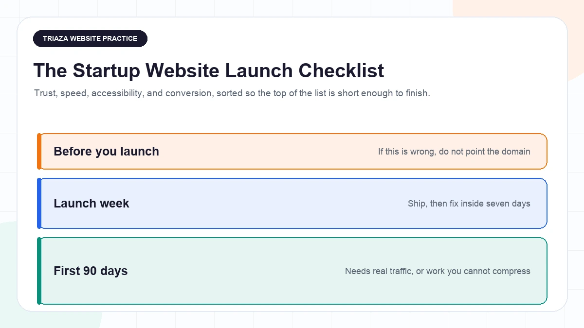
Launch-blocking. If one of these is wrong, don’t point the domain. Short list, on purpose.
Launch week. Ship, then fix inside seven days. Real problems that don’t justify holding a launch.
First 90 days. Work you can’t finish before launch, because it needs data you don’t have yet.
That last tier exists because of an awkward truth: the metrics that matter most are field metrics, measured on real traffic. The three Core Web Vitals are Largest Contentful Paint (good is 2.5 seconds or less), Interaction to Next Paint (200 milliseconds or less), and Cumulative Layout Shift (0.1 or less), and the recommended way to judge them is at the 75th percentile of page loads, segmented across mobile and desktop. On launch day you have zero real page loads. A pre-launch audit tells you what’s broken. It can’t tell you what’s slow for your actual users, on their phones, on their networks. So you launch, then you measure, then you tune.
Tier 1: Launch-Blocking
The Site Has to Work on a Phone
Mobile isn’t the edge case. As of DataReportal’s April 2024 Global Statshot, mobile phones accounted for roughly 59.2% of total web traffic worldwide, a Similarweb figure that DataReportal describes as “very similar to” a separate Statcounter figure of 59.99%. Both are third-party aggregated estimates rather than first-party measurement, and the gap between the two providers is a reminder that the exact number is softer than it looks. The direction isn’t soft at all.
Mobile-first indexing is also just how Google crawls now, so the mobile rendering is the version that gets evaluated. That means content parity: if something exists on desktop and not on mobile, treat it as if it doesn’t exist.
Check that every page renders without horizontal scrolling on a narrow viewport, that tap targets aren’t stacked on each other, that forms are usable with a thumb, and that nothing important hides behind a hover state. If all you have is a laptop, resize the window to 375 pixels wide and use the site for five minutes. Crude, and it catches most of it.
HTTPS, With Nothing Left on Plain HTTP
Google has used HTTPS as a ranking signal since August 2014, and was careful about how small a signal it was: “only a very lightweight signal”, one “affecting fewer than 1% of global queries, and carrying less weight than other signals such as high-quality content”. That’s a description of how little it does, not a benefit to chase, and Google said only that it might strengthen it later.
The actual reason this is launch-blocking sits in the address bar. Chrome has marked plain HTTP pages as “Not Secure” since Chrome 68 in July 2018, escalating to a red warning in Chrome 70 that October when a user types into a form on an HTTP page. A visitor who has never heard of TLS still understands a browser telling them your site isn’t safe.
Check the certificate covers both the apex domain and the www subdomain, that one redirects to the other, and that no image, script, or font is still pulled over HTTP into an HTTPS page.
The Launch-Day Items Nobody Checks
This is the list that produces the worst launch stories, because every item is silent. Nothing errors. The site looks fine.
- The staging
noindexis still in the template. robots.txtwas copied from staging and still disallows everything.- On a relaunch, the old URLs have no redirect map, so every link anyone ever earned now 404s.
- The 404 page is the host’s default, with no way back into the site.
- Analytics was verified on staging and never confirmed firing on production. Worth knowing which property you’re setting up: Google stopped processing new data in standard Universal Analytics properties on July 1, 2023, with historical data viewable through July 1, 2024, so Google Analytics 4 is the property type to be on.
- Open Graph tags are missing, so the first time anyone shares the launch it renders as a gray box.
- No favicon.
None of that is sophisticated. All of it is the kind of thing found six weeks later when someone asks why organic traffic is zero.
Someone Can Reach You, and It’s Obvious Who You Are
Nielsen Norman Group frames website credibility around four factors: design quality, up-front disclosure of things like pricing and contact information and policies, content that’s comprehensive and correct and current, and connection to the rest of the web through external validation. The middle one is the launch blocker. A site with no company name, no human attached to it, and no working way to make contact fails the first test a cautious buyer runs.
NN/g also recommends treating the homepage as an elevator pitch: it should communicate what the organization does and what a visitor can accomplish here, with the most critical content visible without scrolling on any device size. That’s guidance rather than a measured finding, but it’s the right bar. If a stranger can’t answer “what is this and who is it for” from the first screen, that’s a tier 1 problem, not a copywriting refinement.
Pre-customer, with no logos or press or case studies, you’re still not out of options. Name the actual people on an About page. Publish a contact method a human monitors. Be specific about what you do and honest about what you don’t. Show your process or your pricing when competitors hide theirs. None of that requires customers you don’t have yet, and it’s the part of website design founders most often postpone until after launch, when it’s doing the most work at launch.
Keyboard and Screen Reader Basics
Full conformance is a 90-day project. Five things are launch-blocking, because each one locks out a whole class of visitor.
- No keyboard trap. Tab through every page. If focus enters a modal, a menu, or an embedded widget and can’t get out, that’s a blocker.
- Visible focus. If your CSS reset killed the focus outline and nothing replaced it, a keyboard user is navigating blind.
- Every form input has a real, programmatically associated label. Placeholder text is not a label.
- Images that carry meaning have alt text. Decorative images get empty alt attributes.
- Page language is declared on the
htmlelement. One attribute, and screen readers use it to pick a voice.
Three of those five, missing form labels, missing alt text, and an undeclared page language, sit among the most commonly detected accessibility failures across the web, though that’s automated detection only, so it’s a floor rather than the full picture. The other two are here for the opposite reason: a keyboard trap and an invisible focus ring don’t show up in an automated scan at all, and somebody has to press Tab.
Tier 2: Launch Week
Contrast, Targets, and the WCAG Items Worth Knowing
WCAG 2.2 became a W3C Recommendation on October 5, 2023, and content conforming to 2.2 also conforms to 2.0 and 2.1, so there’s no version anxiety here. It adds nine success criteria on top of 2.1, and the ones most likely to touch a startup site cover sticky headers hiding the focused element, tap target size, keeping the help link in a consistent place, not asking for the same information twice in a flow, and not requiring a cognitive test to log in.
Two numbers are worth memorizing. Contrast under Success Criterion 1.4.3 at Level AA is at least 4.5:1 for normal text and at least 3:1 for large text, meaning 18pt or 14pt bold or the equivalent. Those ratios exempt incidental text, such as inactive UI components or pure decoration, and they don’t apply to logotypes at all, so your wordmark isn’t a violation. And Target Size (Minimum), 2.5.8 at Level AA asks for interactive targets of at least 24 by 24 CSS pixels, with defined exceptions for spacing, inline content, and equivalent alternatives elsewhere on the page.
Contrast is launch-week rather than launch-blocking for one reason: it’s usually a token change in one file, and it’s usually everywhere at once.
Navigation the Visitor Can See
NN/g’s menu-design guidance describes the hamburger menu as “a necessary evil on smaller screens” and says it’s “not appropriate for desktop” where there’s room to show navigation, because hiding it costs people their sense of what the site contains. NN/g qualifies that as general best practice rather than an absolute rule, noting that “sometimes new types of menus improve the user experience” while most interfaces are easier to use if they follow the principles.
There’s a measurement behind the guidance. In an NN/g quantitative study of 179 participants across six live websites, run in partnership with WhatUsersDo, hiding the main navigation produced “a more than 20% drop in discoverability” against visible or combo navigation, and made assigned tasks at least 39% slower on desktop and 15% slower on mobile. That’s a specific six-site sample with assigned tasks, not a universal law, but the direction is consistent enough to design around. NN/g separately describes tab and navigation bars as well suited to sites with roughly five or fewer options, framed as a tradeoff rather than a hard cutoff. Most early-stage sites have four or five destinations and should simply show them.
One Next Step Per Page, Labeled Honestly
NN/g’s “4 Ss” framework for link and button labels is Specific, Sincere, Substantial, and Succinct, and the article is explicit that succinctness comes last and has to be balanced against the other three rather than treated as the goal. It’s editorial guidance, not a study, and it’s the fastest fix on this list.
“Learn more” fails specific. “Get started” fails sincere when the next screen is a fourteen-field form. “Book a 20-minute call” passes all four.
Every page gets one obvious next step, not three competing ones.
Cut the Form
Baymard Institute’s checkout research found 26% of online shoppers have abandoned an order specifically because checkout was too long or complicated, and that the average checkout in 2019 carried 12.8 form fields against an achievable minimum of roughly 6 to 8. That comes from Baymard’s benchmark of the world’s 60 largest e-commerce sites, and the 6 to 8 figure refers specifically to guest checkout including payment fields, so it wasn’t measured on contact or demo-request forms and the number doesn’t transfer to yours.
The direction does. Every field is a reason to leave. Ask for what you need to take the next step, not what you’d like for the CRM.
The Above-the-Fold Question
In a 2018 eye-tracking study, NN/g measured 57% of page-viewing time above the fold and 74% within the first two screenfuls, from more than 130,000 fixations across 120 participants. The authors note the analysis disregards maximum page length, so that concentration could reflect short pages or people giving up after two screenfuls rather than a hard attention cutoff. It fits an earlier NN/g finding that the first ten seconds decide whether someone stays, with visitors who reach about 30 seconds having a fair chance of staying two minutes or longer, though Nielsen cautions that averages are “not the most fruitful way of analyzing” this because visits cluster at very short or much longer than the mean.
The reading isn’t “cram everything into the first screen”. People scroll. It’s that the first screen decides whether they bother.
This is also the week for titles, meta descriptions, a sitemap, and internal links that make sense. Our SEO fundamentals for startups guide walks through those. Do them because they describe your pages accurately to someone reading a results list, not because any one of them is a lever.
Tier 3: The First 90 Days
Core Web Vitals, Measured on Real Traffic
Now the field data arrives and the thresholds from earlier become actionable. One piece of history matters so you’re reading the right metric: Interaction to Next Paint officially replaced First Input Delay as a Core Web Vital in March 2024, and Chrome’s announcement gave developers until September 9, 2024 to transition, scoping that deadline specifically to “consumers of the Chrome User Experience Report (CrUX) or PageSpeed Insights APIs”. FID is retired. If a tutorial or an agency proposal still centers it, that’s your tell about how current the advice is.
Page experience signals began rolling out in Google Search in May 2021, combined with existing signals including mobile-friendliness, HTTPS, and the intrusive interstitial guidelines. Combined is the operative word, and it’s the same point as the opening: one of several, not a switch.
What Speed Work Is Actually Worth
The honest evidence here is thinner than the industry pretends, and most of the numbers you’ve seen quoted don’t survive a look at their source. One that does: Vodafone ran a controlled A/B test where the variant with a 31% better field LCP produced an 8% increase in sales, alongside a 15% uplift in lead-to-visit rate. It was a 50/50 split on a single landing page, paid media traffic only, with the two versions identical apart from the performance work, and the absolute baselines were redacted, so only relative percentages are public. One company, one page, one traffic source. Not a promise about yours.
What it establishes is that the relationship is real and worth measuring on your own site rather than assuming from a case study. Start with images, where almost every startup site’s LCP problem lives: correctly sized, modern formats, explicit width and height so nothing shifts as they load. Getting field data at all needs measurement installed and verified, and our rundown of SEO tools for small businesses covers the free ones that matter most at this stage.
Accessibility as a Conformance Pass, Not a Checkbox
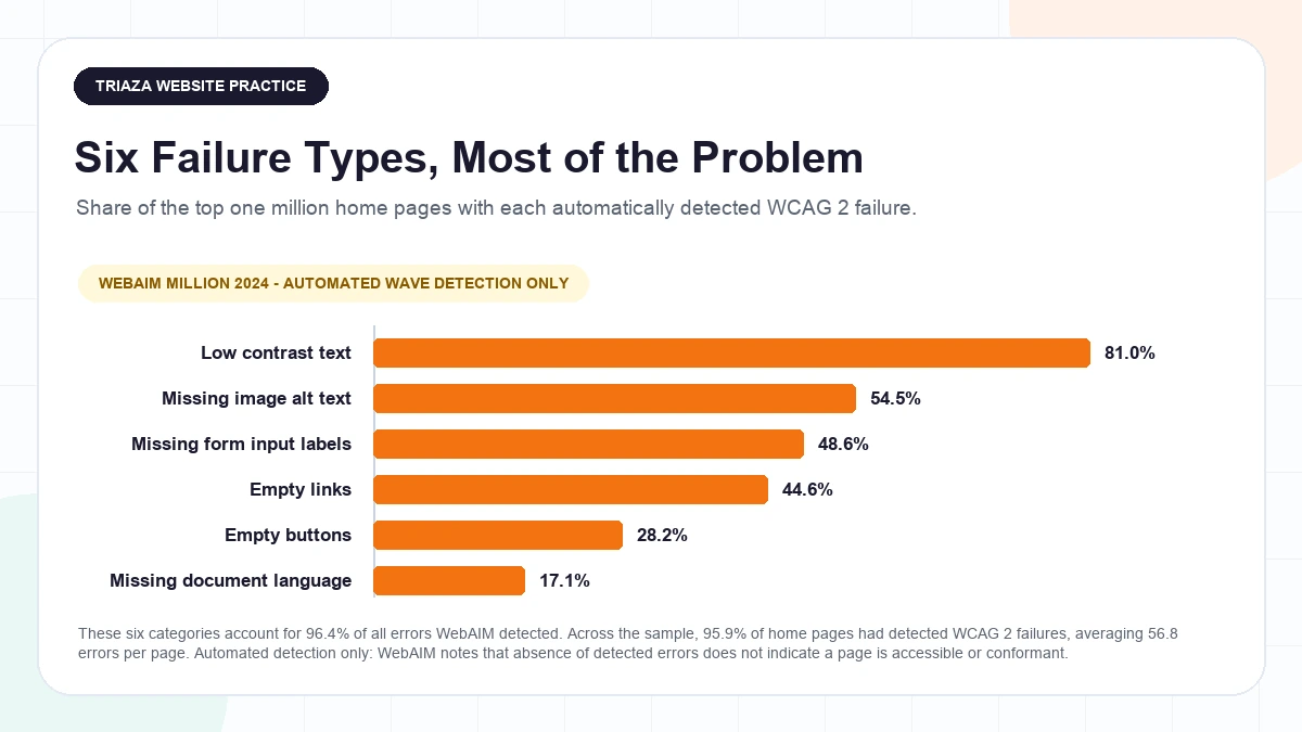
WebAIM’s 2024 evaluation of the top one million home pages found detected WCAG 2 failures on 95.9% of them, averaging 56.8 distinct errors per page, up 13.6% from 50 the year before. Those are only automatically detectable failures found by WebAIM’s WAVE engine, and WebAIM is direct that “absence of detected errors does not indicate that a page is accessible or conformant” and that not all conformance failures can be caught automatically, which means the real figure is higher, not lower.
The useful part is how concentrated they are. WebAIM reports that 96.4% of all detected errors fall into just six categories, so a conformance pass that starts with those six clears most of the automated surface before anyone opens a screen reader.
On the regulatory side, the direction of travel is visible even where the rules don’t reach you. The Department of Justice published a final rule under ADA Title II on April 24, 2024 requiring state and local government websites and mobile apps to meet WCAG 2.1 Level AA, with deadlines of April 26, 2027 for public entities serving 50,000 people or more and April 26, 2028 for smaller ones. That rule covers state and local government, so it creates no obligation for a private startup. It’s context for where enforcement is heading, not a date on your calendar.
Trust Compounds After Launch
The fourth of NN/g’s credibility factors, connection to the rest of the web, is the one you can only build after you exist. Worth knowing which direction to build it: NN/g reports that people trust testimonials on external review sites more than the ones a company lists on its own site, and that having a presence on external review sites matters more than on-site testimonials, a finding from a small moderated qualitative study in which every participant said they’d read reviews before choosing a company to hire. Treat that as a strong signal from a handful of people rather than a population statistic. Either way, the quarter-one work is being reviewable somewhere you don’t control, not adding a third quote carousel. Once review requests become part of the operating system, use the FTC fake reviews rule checklist to audit incentives, insider relationships, moderation, and testimonial reuse.
Content, and the Thing That Actually Moves Rankings
Google described its March 2024 core update as more complex than a typical one, involving changes to multiple core ranking systems and marking “an evolution in how we identify the helpfulness of content” through a variety of signals and approaches rather than “one signal or system”. Google said the rollout could take up to a month with more ranking fluctuation than usual, and, more to the point for anyone launching: “There’s nothing new or special that creators need to do for this update as long as they’ve been making satisfying content meant for people.”
That’s the sentence to hold onto through the whole tier 3 list. The technical work removes obstacles. It doesn’t substitute for the content.
The Maintenance Surface
Launch isn’t a finish line, it’s the start of a recurring obligation. Links rot. Content goes stale. Dependencies need updating, and the ones that don’t get updated are the ones that get exploited. The field metrics you finally have need somebody to look at them. And per that same NN/g research, the typos and broken links that accumulate quietly read as carelessness, degrading credibility and communicating “an overall lack of attention to detail”.
None of that is dramatic and all of it is why website maintenance is a standing job rather than a project. The version that works is a short recurring review, not a heroic annual audit. Once you’re past launch and the question becomes what to check and how often, our website maintenance checklist sorts that work by cadence.
What to Skip Before Launch
The most common way to miss a launch date is doing tier 3 work in tier 1 time. Things to consciously not do this week:
- Exhaustive schema markup. Structured data describes your page to machines in a format they can parse. It’s useful. It isn’t a ranking switch, and a launch is not the moment to mark up every entity on the site.
- Chasing a perfect Lighthouse score. Lighthouse runs a synthetic test on a simulated device. It’s a debugging tool, and optimizing a lab number before you have a single real page load is optimizing the wrong thing.
- A full blog. If the product page isn’t clear yet, twelve articles pointing at it won’t help.
- AAA-level accessibility across the whole site. Get to a solid AA. AAA isn’t expected as a site-wide target and the effort is better spent elsewhere.
- Redesigning based on nobody’s feedback. You’re about to get real users. Let the first 90 days tell you what to change.
Before You Point the Domain
Three questions, in order. Is anything on the launch-blocking list wrong? Is the launch-week list written down with an owner and a date? Do you have measurement running, so the first 90 days are informed by your traffic rather than someone else’s case study?
If you want a second set of eyes on any of it, that’s the shape of our website design work: getting the launch-blocking list actually closed, and leaving you with a site you can maintain.
Questions Founders Ask Before Launch
What actually has to be done before I point the domain? Five things. The site works on a phone. Everything is served over HTTPS, with nothing still pulled in over plain HTTP. The homepage says who you are and what a visitor can do here, visible without scrolling, with a real contact method attached to a real company identity. Nothing is blocking indexing or analytics by accident, including a leftover staging noindex or robots.txt. And keyboard users aren’t trapped: visible focus, labeled inputs, alt text on meaningful images.
How fast does my site need to be? The Core Web Vitals targets are 2.5 seconds or less for Largest Contentful Paint, 200 milliseconds or less for Interaction to Next Paint, and 0.1 or less for Cumulative Layout Shift, judged at the 75th percentile of real page loads, segmented across mobile and desktop. You can’t pass or fail them on launch day, because you have no real page loads yet. Launch, measure for a few weeks, then tune.
Do I need to be WCAG compliant if I’m a private company? WCAG 2.2 is a W3C Recommendation, not a law, and Level AA is the bar most requirements point at. The DOJ’s April 2024 final rule under ADA Title II requires WCAG 2.1 Level AA, but it applies to state and local government entities, with deadlines in April 2027 and April 2028 depending on population served, and creates no obligation for a private startup. Treat AA as the practical bar because it’s what makes the site usable, not because a deadline applies to you.
Will a faster site rank higher? Not on its own. Google’s position is that page experience is one of hundreds of signals and that “a good page experience doesn’t override having great, relevant content”, mattering most when several pages have similar content. Speed is worth doing for the visitor. Treat any ranking effect as a tiebreaker.
Is a hamburger menu fine on desktop? NN/g’s guidance says no: it calls the hamburger “a necessary evil on smaller screens” and “not appropriate for desktop”, qualifying that as general best practice rather than an absolute rule. Its study of 179 participants across six live websites measured “a more than 20% drop in discoverability” when navigation was hidden, on a six-site sample with assigned tasks rather than as a universal law. If you have five destinations, just show them.
How much of my homepage do people actually see? NN/g’s 2018 eye-tracking study measured 57% of viewing time above the fold and 74% within the first two screenfuls, from over 130,000 fixations across 120 participants. The authors caution that the analysis disregards page length, so that concentration might reflect short pages or abandoned scrolling rather than a hard attention limit. People do scroll. The first screen decides whether they want to.
What can I safely skip until after launch? Exhaustive schema markup, a perfect Lighthouse score on synthetic data, a full blog before the product page is clear, and AAA-level accessibility site-wide. Also any redesign based on opinions rather than the real users you’re about to have.
What do I actually need to monitor after launch? Field performance data, search coverage, and whether your forms are submitting. Google Analytics 4 is the property type to be on: standard Universal Analytics properties stopped processing new data on July 1, 2023, with historical data viewable through July 1, 2024. Verify the tag fires on the production domain, not just staging, before you need the data.